It’s no secret that advertising that resonates with consumers at an emotional level typically has more impact long term, but that’s often easier said than done.
Together with Sign Salad, we’ve conducted an ’emotional audit’ of advertising in a category where emotion is particularly important – the charity sector. Using our innovative PrismCEPTM approach to evaluate ads, we first used the CEPTM Test to quantitatively measure the emotional and cognitive power of over 20 recent charity ads, and then used semiotics to decode why these ads work in the way that they do.

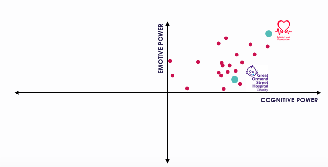
What struck us straight away was that every single one of these ads sits in the top right hand quadrant of our CEPTM Matrix – they all have emotive power (they can influence consumers feelings through empathy or creativity), and they all also have a degree of cognitive power (in that they are able to impart new, interest or valuable information). Perhaps unsurprisingly, charity ads are pretty good at tugging on the heartstrings and getting consumers to act!

Digging deeper however, with the help of semiotics, we were able to separate the great from the good!
A Good Ad: Great Ormond Street Hospital
This ad is fairly classic of the genre – it starts with people’s emotional stories with slow, sad music, before building into something more positive as the resolution is shared with the viewer. It follows a classic narrative arc, with a distant narrator telling us what’s going on, urging us to donate money (rather than actively help), reflecting the dominant idea of expert authority. It’s a great ad – it moves people and motivates them to act!
However, what our analysis has shown us is that you don’t have to follow this approach to succeed in this category.
We found that the most successful charity ads employ key cultural codes that are relevant far beyond the charitable sector.
A Great Ad: British Heart Foundation
This is a great example of an ad that scores really highly on emotive power by breaking category norms, using a key cultural code (Everyday Britishness) as well as an emergent cultural code (Peer-to-Peer Engagement), whilst also borrowing stylistically from the CPG category.
The chatty, chubby cheeked character speaks in colloquial style, with a northern accent, reflecting the lovable rascal character deeply embedded in UK culture (think Just William and Horrid Henry!). He appears in an everyday, down-to-earth setting, similar to CPG advertising. This helps to make heart disease an accessible and everyday topic, not a taboo, and results in a very strong response to the ad
PrismCEPTM is a joint approach from Sign Salad and Tapestry:
- The CEPTM test is an effective way to quantitatively measure emotive power, comparing within (and across) categories, helping us to understand category norms.
- Using semiotics we not only decode how and why an ad scores in a certain way, we can also uncover cultural and competitor norms to identify ways to disrupt a category
To find out more about our approach, contact Jemma.


